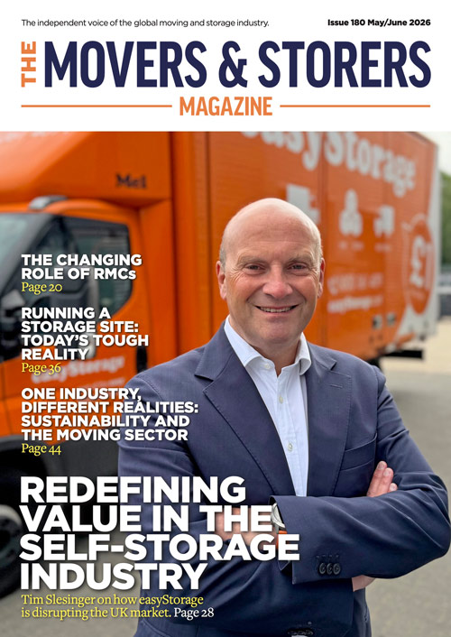
OUT NOW: MAY/JUNE ’26 ISSUE #180
News and insights from the movers and storers industry

1st July 2026
Editorial Team
When someone lands on your self-storage website, they decide in seconds whether to stay or click away. In an industry where customers are handing over furniture, family belongings or business stock, first impressions are everything. A confusing, outdated or unprofessional site sends them straight to your competitors.
The best-performing storage websites are simple, clear and reassuring from the moment the homepage loads.
Here’s exactly what builds instant trust and what kills it.
Tell them instantly who you are and where you are. A vague “Welcome” headline tells visitors nothing.
Good examples:
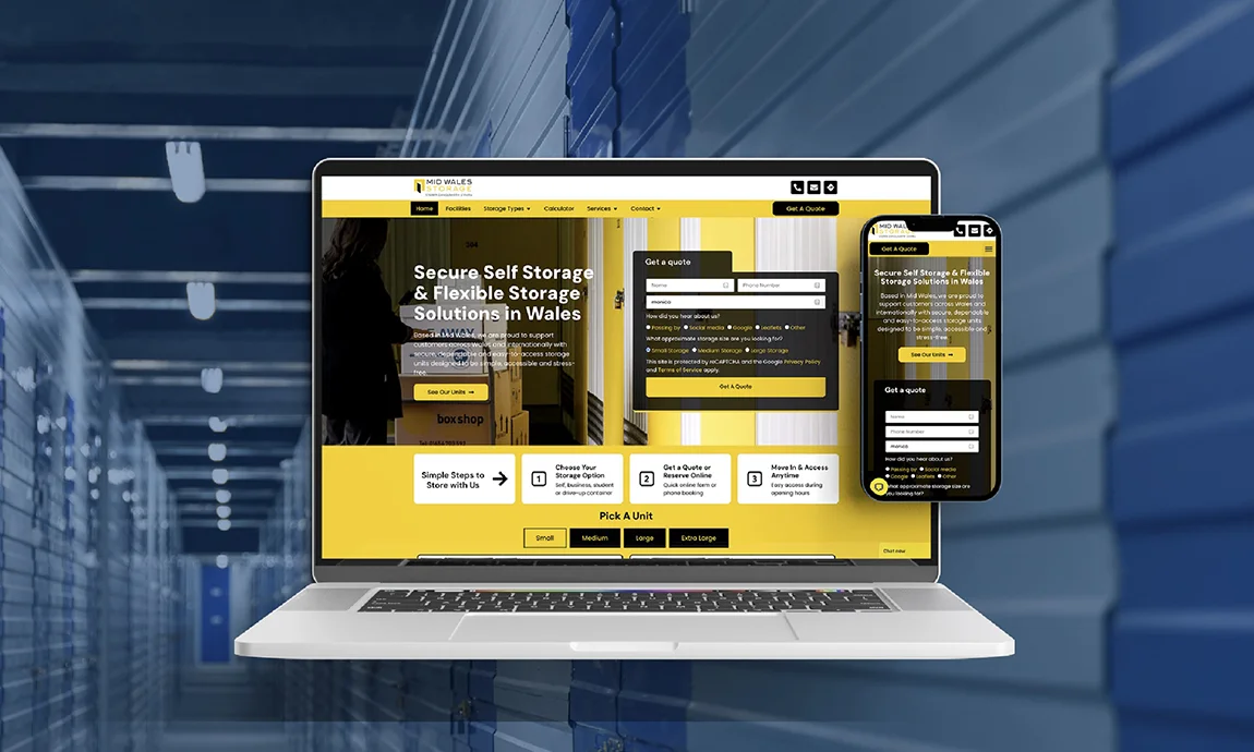
Stock images scream “generic”. Real photos of your actual units, reception, team, security gates, vans and containers build instant credibility.
Even good smartphone shots of your site work better than polished library pictures.
Nothing beats social proof. Show your Google rating and a few short customer quotes near the top of the homepage, on location pages and next to enquiry forms.
Positive comments about security, helpful staff and value are particularly powerful.
Phone number, email, address and opening hours must be easy to find — ideally in the top header on every page, especially on mobile.
Never make customers hunt.
Display:
A slow or broken mobile site instantly damages trust. Most storage searches happen on phones — buttons must be large, text readable and forms simple.
Tell visitors exactly what to do next: “Get a Quote”, “Check Availability”, “Reserve a Unit” or “Call Now”.
Make the next step obvious.
Guide pricing, unit size charts, storage calculators and a concise FAQ section remove uncertainty and encourage enquiries.
Even small issues create a “something doesn’t feel right” feeling.
You don’t need a full redesign. Try these high-impact changes:

When potential customers search “self storage near me” or “storage units in Birmingham,” they open multiple websites side by side to compare them. If yours loads slowly, feels confusing to navigate, or doesn’t instantly answer their basic questions, they’ll bounce before ever reaching out. Trust, clarity, and effortless usability beat flashy design every single time — but when you combine both, you’ve got a website that truly wins.
Rahul Vekaria, Managing Director, Amax Marketing.

All the best bits, delivered once a month straight to your inbox
News and insights from the movers and storers industry